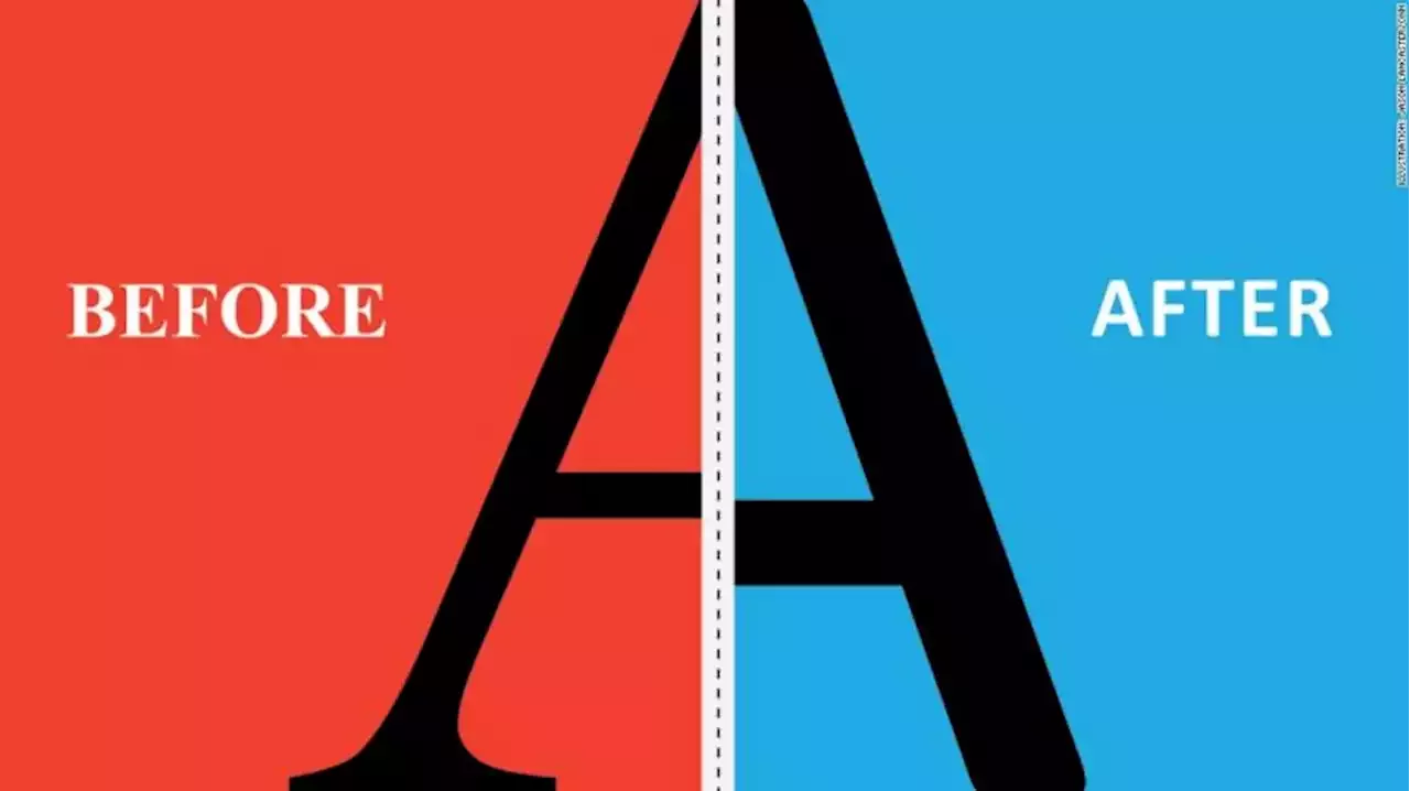
Secretary of State Antony Blinken’s email about the change was titled “The Times (New Roman) are a-Changin,” according to the Washington Post.
On Monday, the US State Department’s domestic offices, bureaus and posts overseas will begin communicating in a style that’s unlike any other they’ve ever used before: The agency will ditch Times New Roman, a font it has been using since February 2004, and switch to the plainer Calibri. Secretary of State Antony Blinken’s email about the change was titled “The Times are a-Changin,” according to the Washington Post. The new typeface came recommended by internal diversity and disability groups.
“Typeface is important to readability, which is how easy your text is to read,” Lewthwaite said. Reading involves a collaboration between those areas of the brain that support language and those areas of the visual system that allow the brain to recognize objects, explains Dr. Guinevere Eden, a professor in the Department of Pediatrics and director of the Center for the Study of Learning at Georgetown University, whose areas of study include the neural bases for reading.
