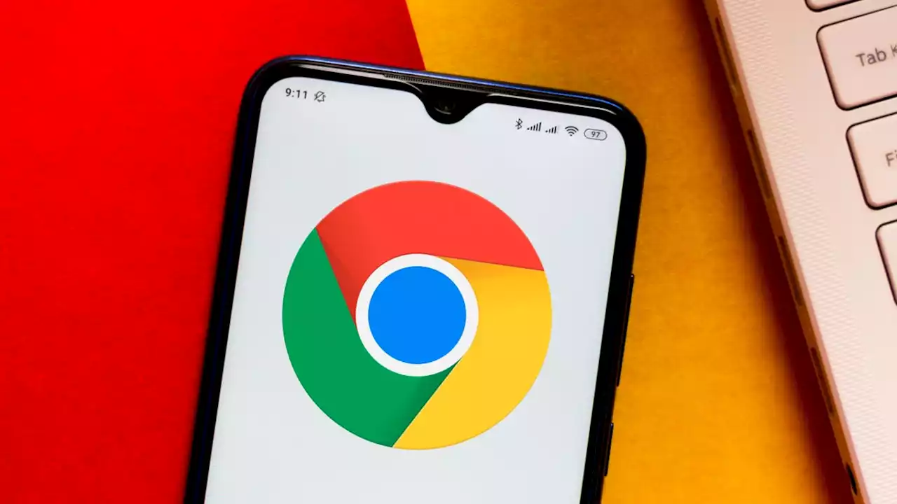
Google Chrome’s New Icon Looks Pretty Much the Same to my Untrained Eyes
. “[W]e also found that placing certain shades of green and red next to each other created an unpleasant color vibration, so we introduced a very subtle gradient to the main icon to mitigate that, making the icon more accessible.”According to Elvin, there will be specific versions of Chrome’s new icon for each operating system. For Windows, the icon will have a gradated look, but it, the icon will look 3D. Chrome’s other apps, Beta and Dev, have also gotten a refresh.
Google wasn’t closed to creating a Chrome icon that was more different than the one they settled on, though. Elvin said the team considered creating an icon with more negative white space but decided against it because it shrunk the icon and made it difficult to identify alongside other Google apps. .
To that I say, well, OK. I get it. Although I’d wager that if they refreshed the icons and just didn’t announce it, few people would have noticed the difference. Yet again, there are a lot of designers out there with sharp eyes, so who knows.The refreshed logos will start appearing in the Chrome app and on the web in the next few months.
United States Latest News, United States Headlines
Similar News:You can also read news stories similar to this one that we have collected from other news sources.
![]() Google is making changes to the Chrome icon for the first time since 2014For the first time in eight years, Google is changing the icon it is using for the Chrome Browser based on the OS being used.
Google is making changes to the Chrome icon for the first time since 2014For the first time in eight years, Google is changing the icon it is using for the Chrome Browser based on the OS being used.
Read more »
![]() Google made a more accessible icon for Chrome | EngadgetGoogle has redesigned the icon for Chrome to make it more accessible and more at home on different operating systems..
Google made a more accessible icon for Chrome | EngadgetGoogle has redesigned the icon for Chrome to make it more accessible and more at home on different operating systems..
Read more »
![]() Google quickly exterminates Pixel 6 line's Magic Eraser bug with simple fixThe Magic Eraser bug which caused the Google Photos app to crash on the Pixel 6 and Pixel 6 Pro has been fixed by Google.
Google quickly exterminates Pixel 6 line's Magic Eraser bug with simple fixThe Magic Eraser bug which caused the Google Photos app to crash on the Pixel 6 and Pixel 6 Pro has been fixed by Google.
Read more »
 Google tested a smarter, contextually aware full-page version of 'At a Glance' for Android 11Screenshots reveal changes that Google was working on for Android 11 featuring a smarter, more contextually aware 'At a Glance' widget.
Read more »
 Google Messages update allows users to send Photos links for sharper videos and picturesGoogle is pushing out a redesign to its Messages app that includes integration with Photos in order to send sharper videos and images via the app.
Read more »
